Case study: Elevate Sound & Entertainment
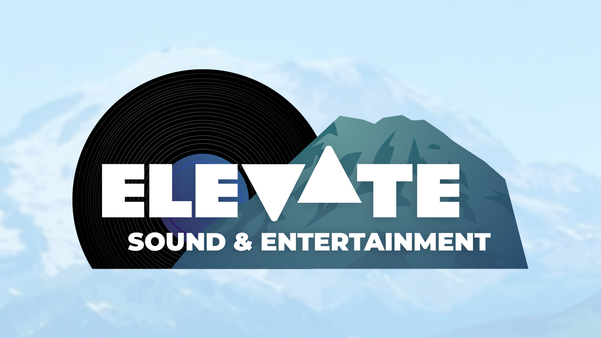
A visual identity was developed for Elevate Sound & Entertainment, a DJ and event company. This design is used in printed formats large (banners) and small (stickers, business cards), as well as digital media (web headers, promotional videos, social media) – it had to be easily readable at different sizes and readily adjust to fit different ratios.
Apart from the name, the client did not have any specific preferences or requests for the design. My first step was to assemble moodboards to quickly get a sense of the client's tastes and desires:
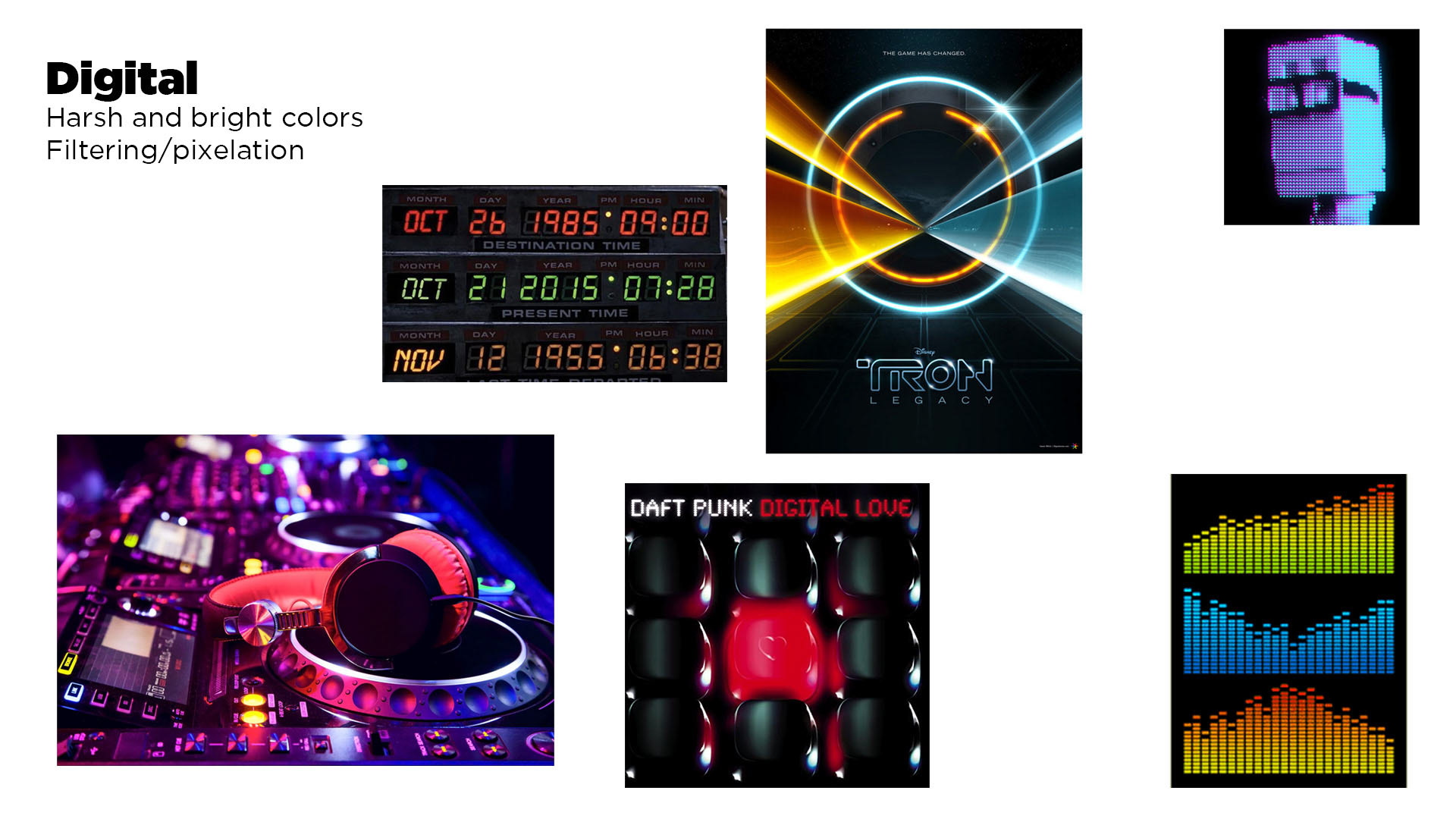
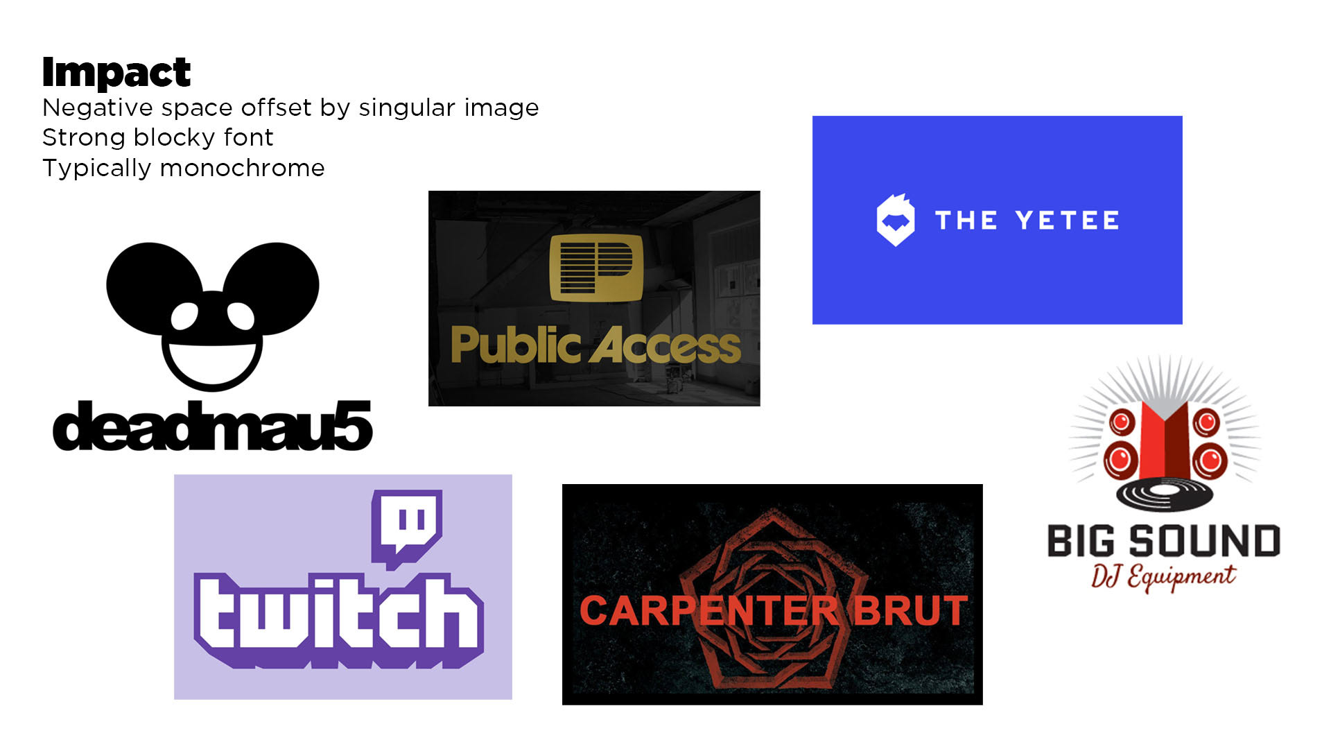
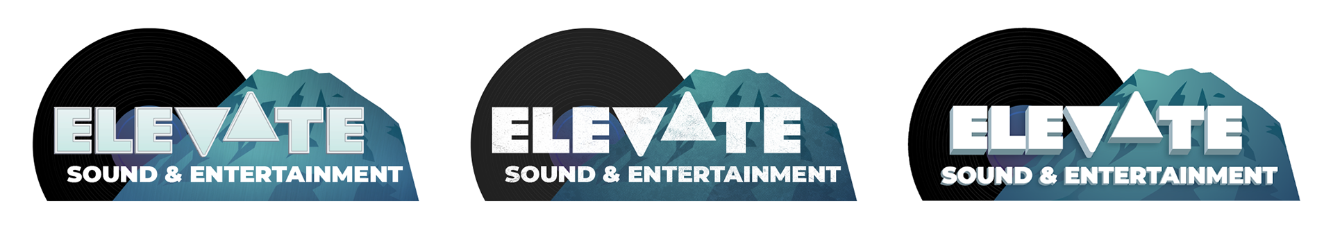
Initial direction favored bold styling (primarily the "Impact" moodboard), adding the keywords "simple, modern, slick, professional, recognizable". Three designs were submitted for the first round, many leaning on Mount Rainier (to focus on the local Seattle market) and a vinyl record (reinforcing the DJ role). I also made the decision to emphasize the single word "ELEVATE", as the full company name was rather long. These designs were created in monochrome, to help the client focus on layouts without being distracted by color choices.
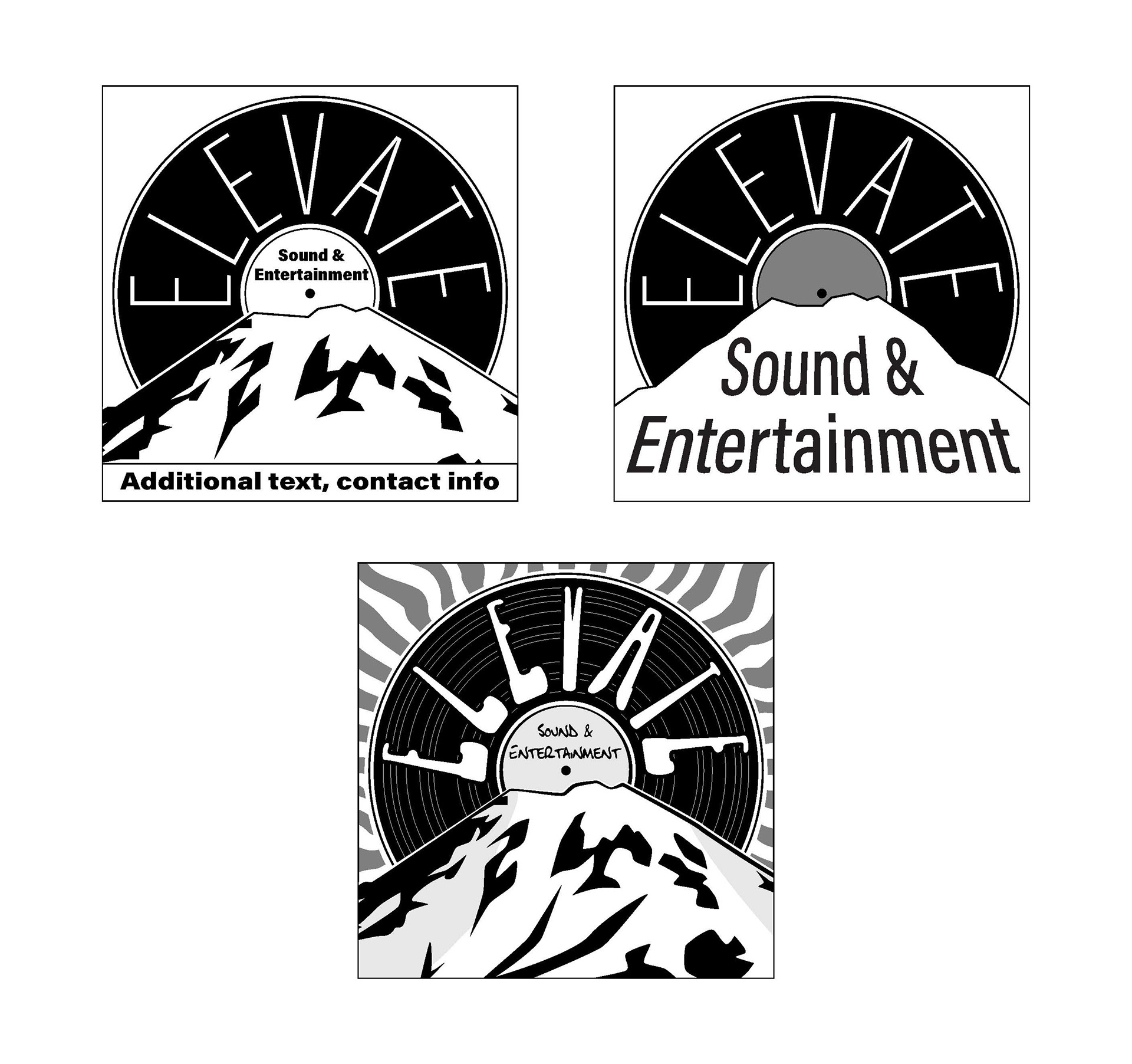
"Sunrise"
"Peak"
"Flying V"
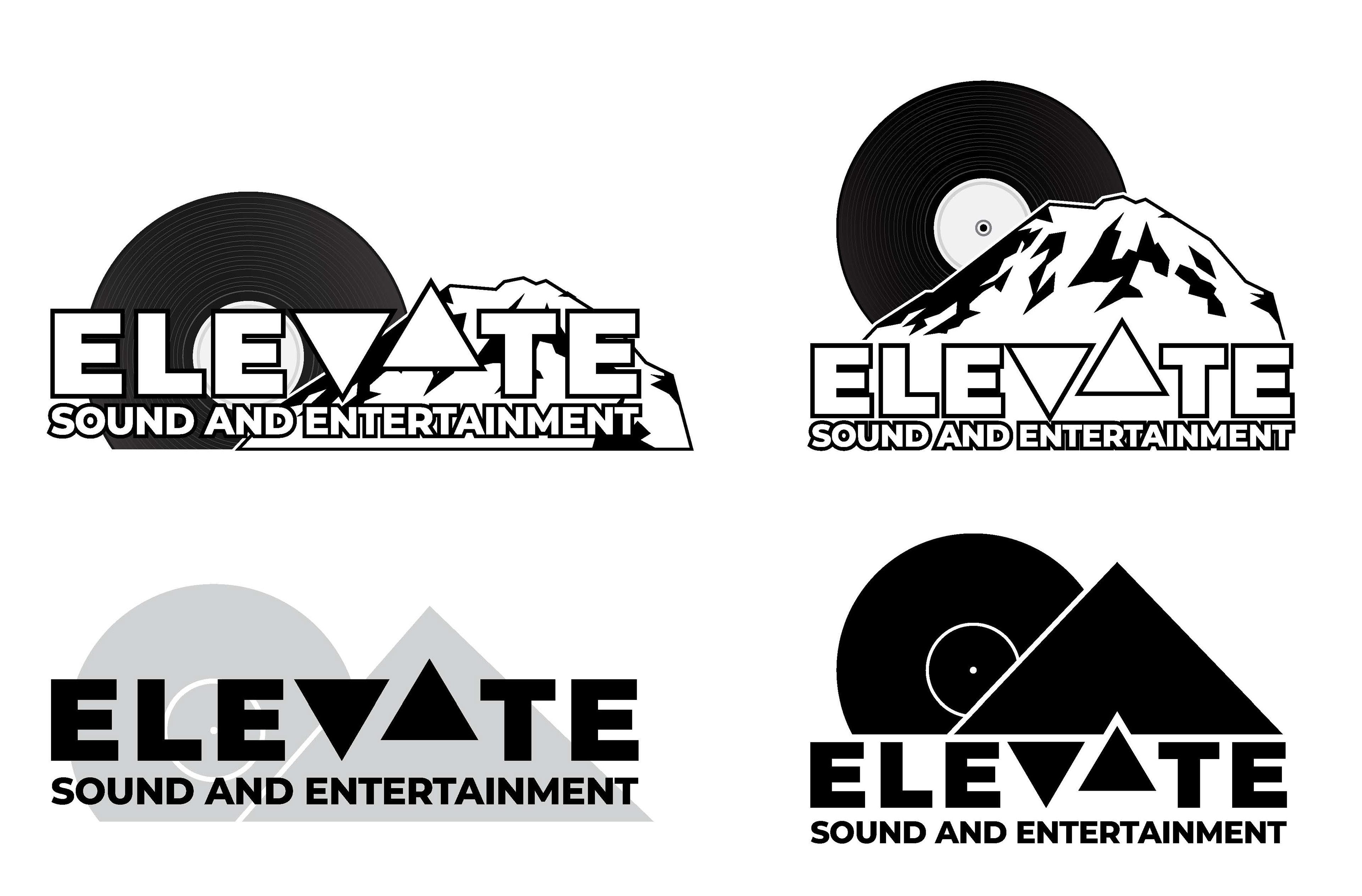
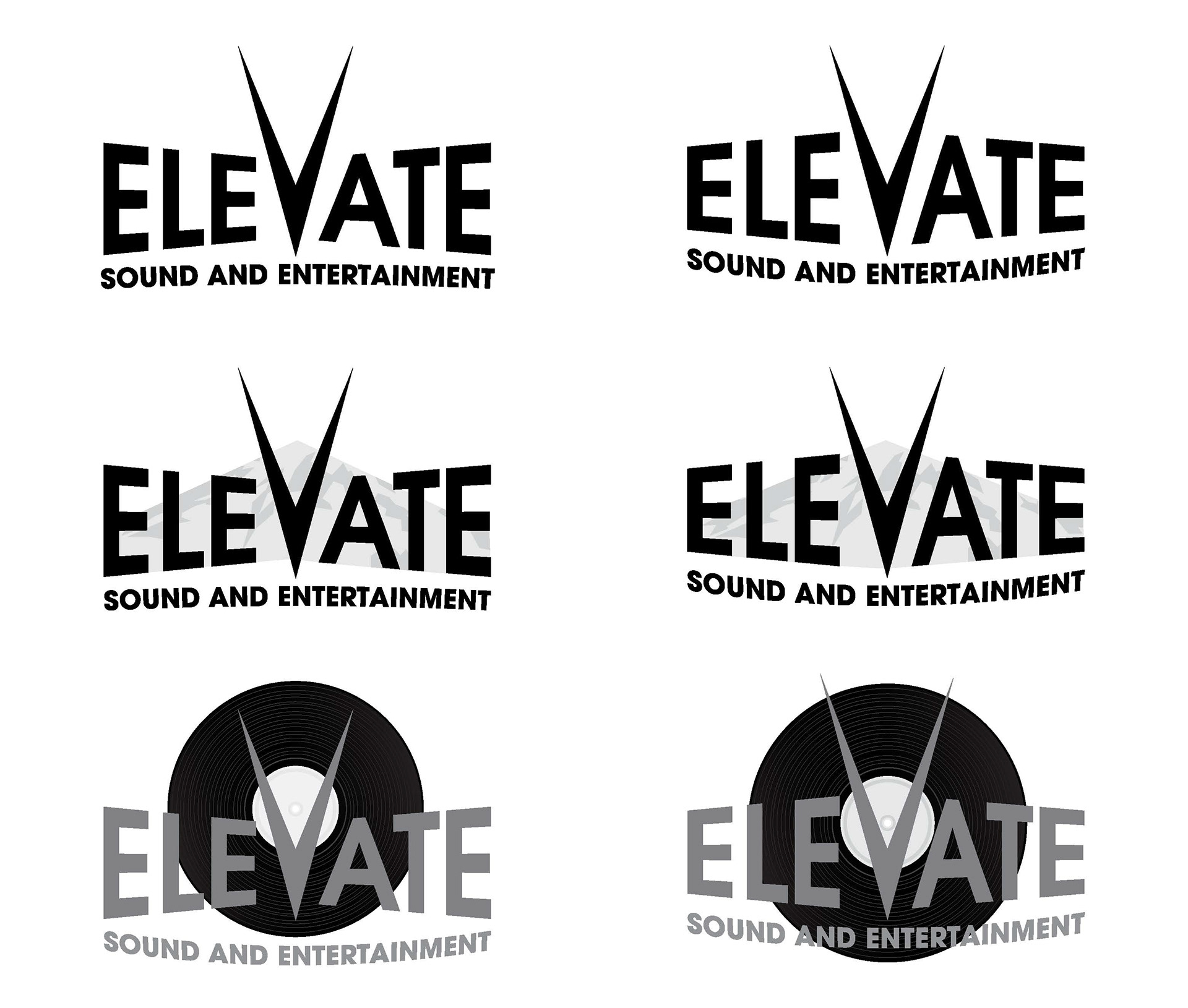
The second design (with the V and A in "Elevate" stylized to evoke an elevator control panel) was selected, with feedback that the mountain ought to be raised. The client expressed a preference for cool colors, so the next round of designs explored blues and greens alongside tweaking the look.
I also explored some more stylized text treatments, but found that these distracted from the "clean" look of the background shapes. The client agreed, and we did not pursue this further.
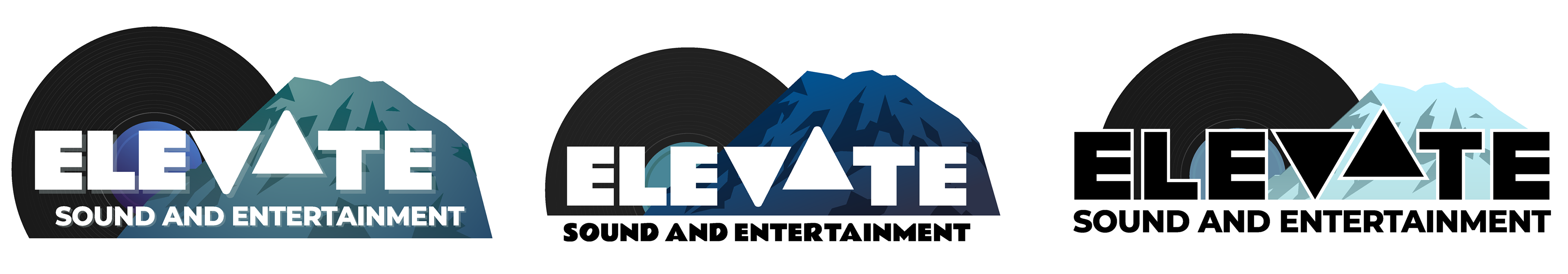
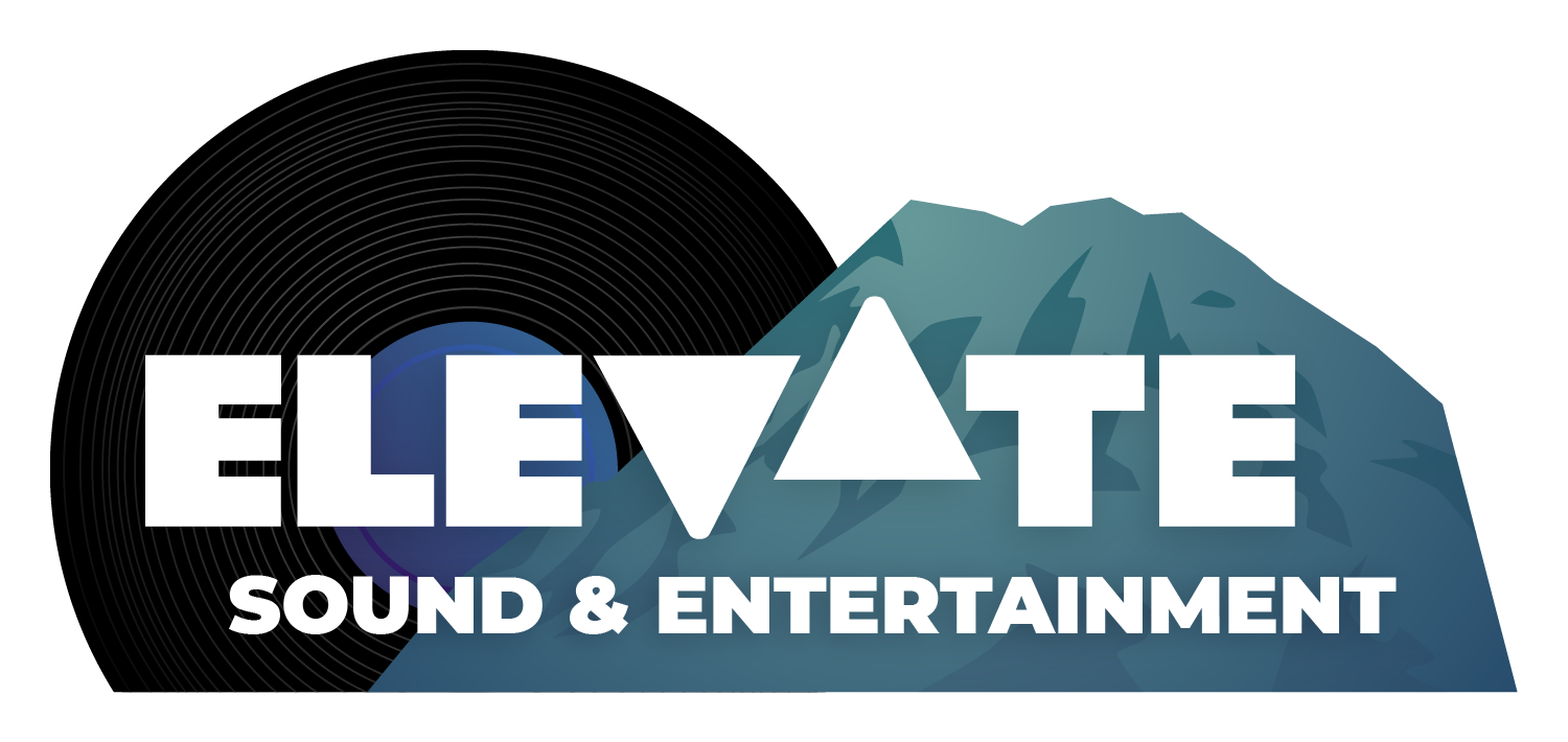
The final round of revisions was done live on a video call, allowing us to explore adjustments on-the-fly rather than an extended email chain. The final deliverables included the extended wordmark, a version for social media icons, and a quick reference brand guide indicating fonts and colors to use:
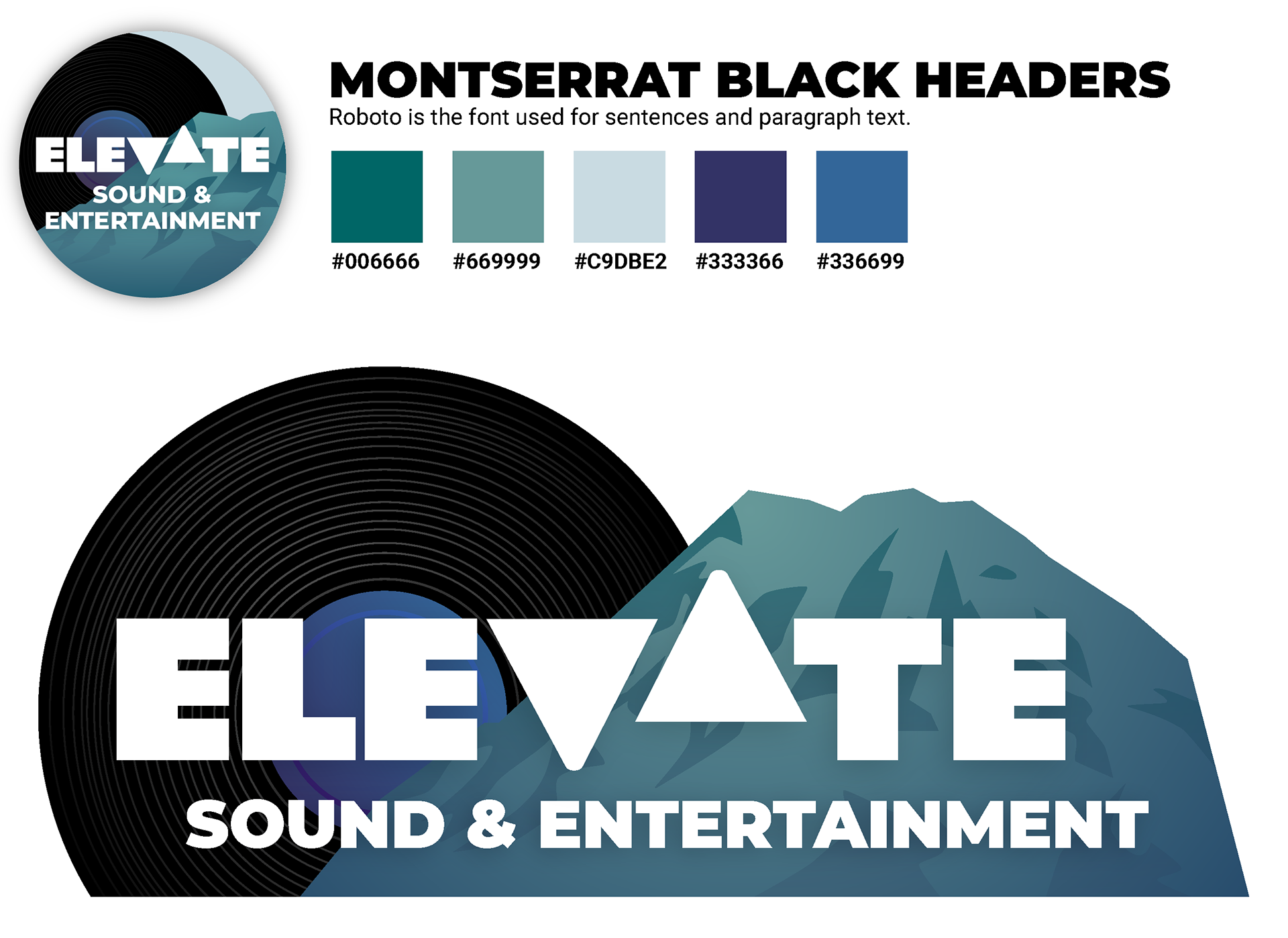
Brand guide
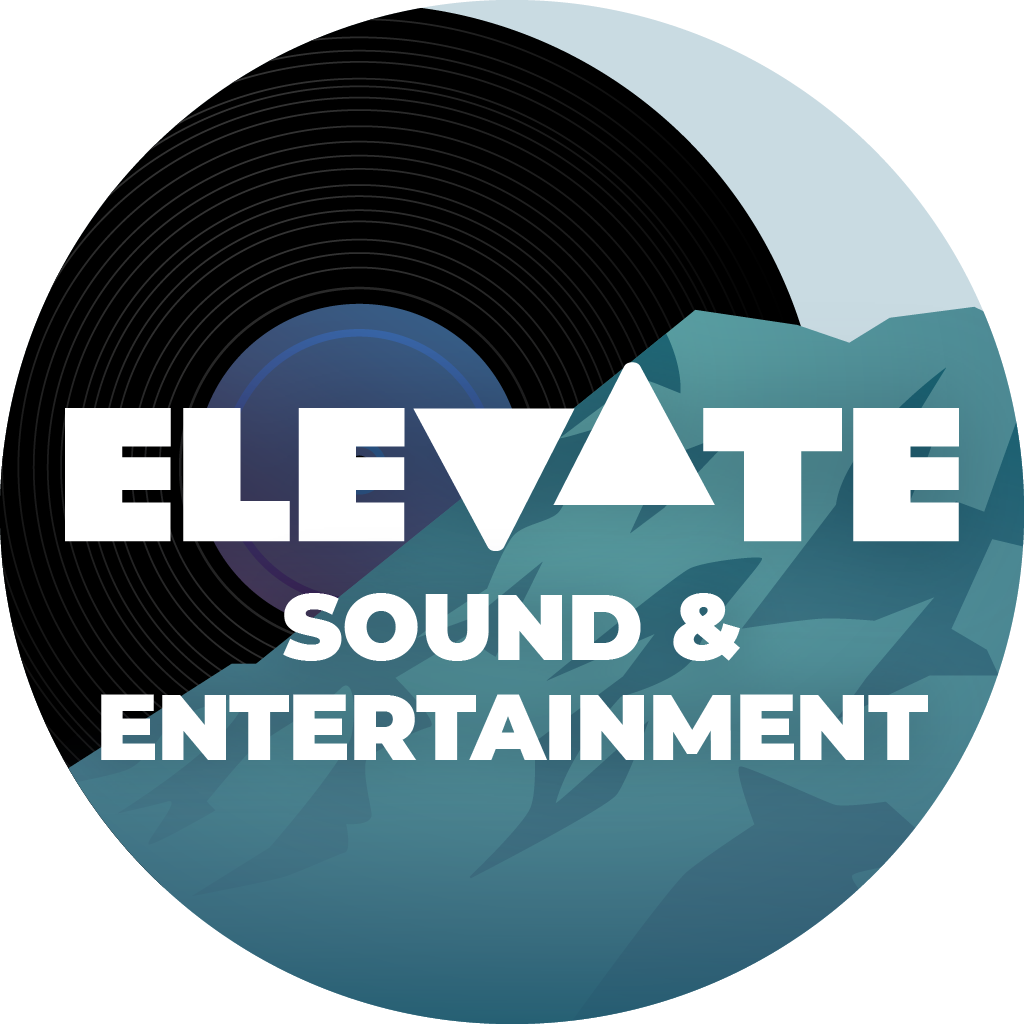
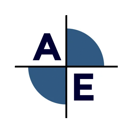
Social media avatar/favicon
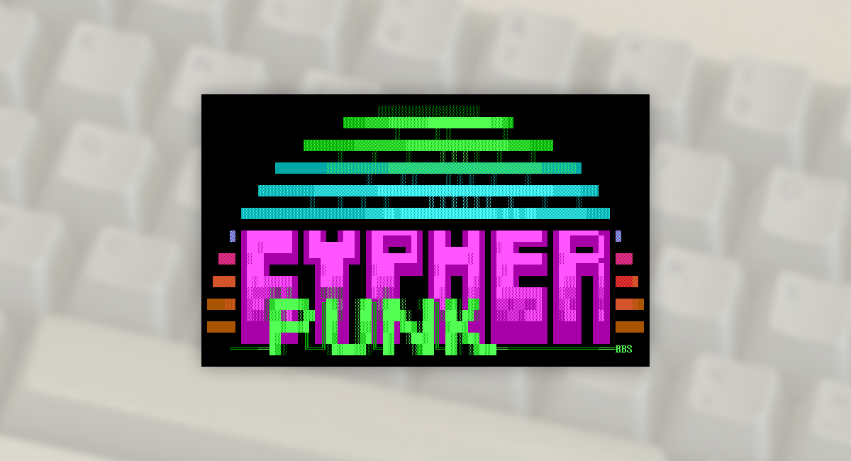
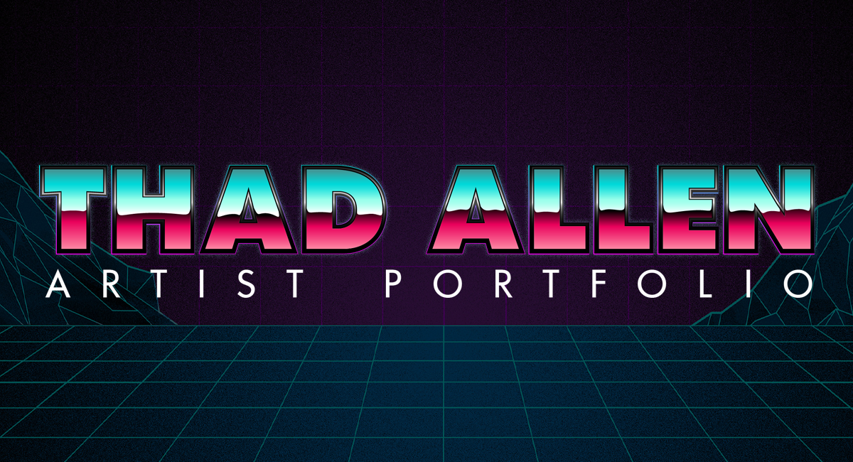
Additional Work

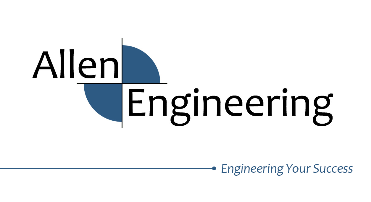
The 2/4 filled circular mark is evocative of the elevation symbol common on architectural diagrams.
The favicon (right) uses a simpler, heavier font to improve clarity at its reduced size.
The favicon (right) uses a simpler, heavier font to improve clarity at its reduced size.
Developed to fit in the Dartmouth College brand.